Your website’s homepage holds the key to captivating your audience and leaving a lasting impression. Within a matter of seconds, it must convey your value proposition and engage visitors to keep them hooked. Unfortunately, we’ve come across one too many poorly designed homepages that look a little like this—not pretty, to say the least.
If you’re unsure whether your current homepage measures up, fear not. We’ve got you covered. Here are seven simple tips to transform your homepage into an irresistible magnet that keeps visitors glued to your website.
Captivating Headline
Within the first few seconds of arriving on your homepage, your website should convey what your business or brand offers. Crafting a headline that targets a specific audience segment and clearly communicates your value proposition is key to engaging visitors within the first few seconds. Avoid jargon and keep it simple yet effective.
For instance, the headline “Discover the Finest Handcrafted Jewellery” instantly communicates the unique selling point of a jewellery brand, enticing visitors to explore further.
Primary Calls-to-Action (CTAs)
Call-to-action buttons guide visitors to take specific actions on your website, such as making a purchase or signing up for a newsletter. To maximise their effectiveness, strategically place striking CTAs above the fold to direct visitors towards a certain goal.
Consider using action phrases like “Get Your Free Trial Now” or “Book Your Appointment Today.” Action phrases clearly communicate the outcome and use persuasive language to encourage visitors to engage further.
Tip: Don’t forget to add alt text for accessibility and SEO.
Visually appealing imagery
Humans are naturally drawn to visual elements, making imagery a powerful tool for enhancing your homepage. By incorporating relevant and high-quality images, you can evoke emotions and create a memorable initial impact.
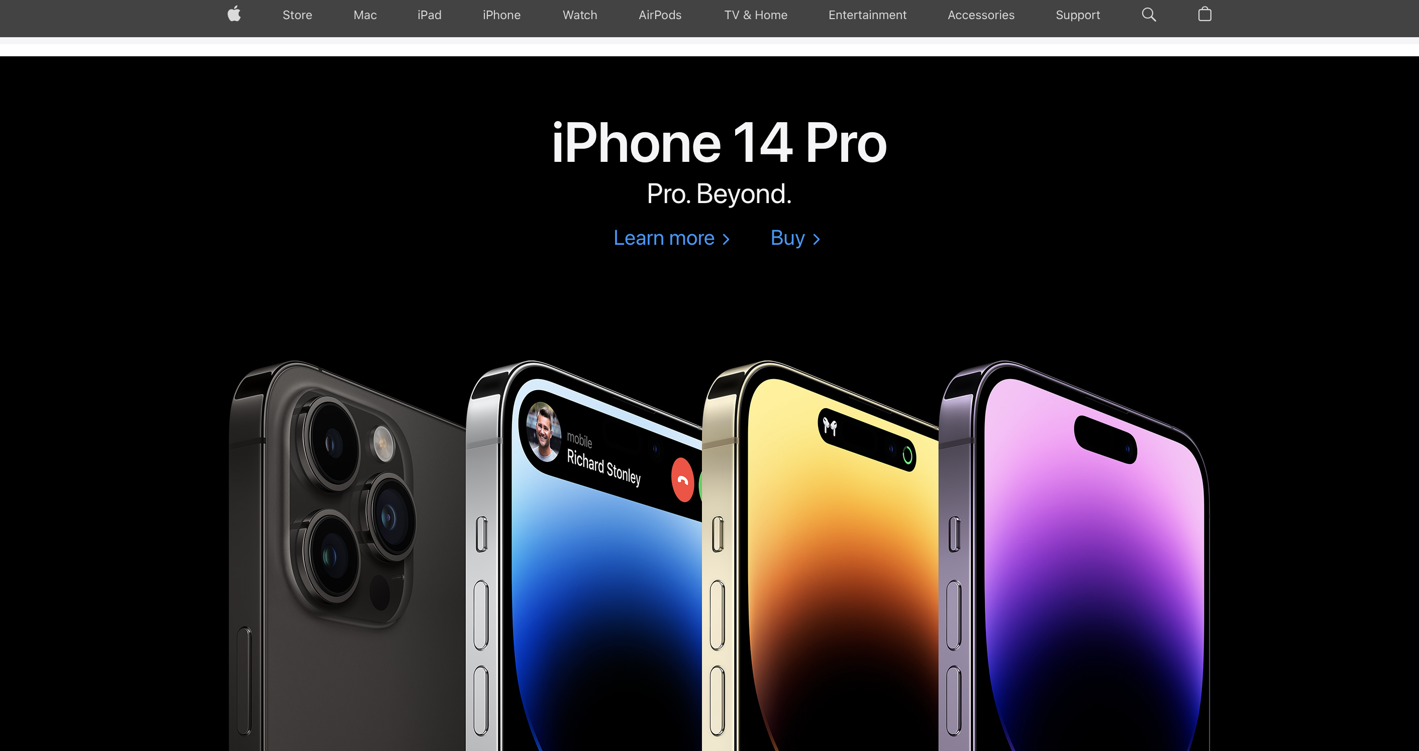
Apple is renowned for its sleek and visually stunning design aesthetic, and their website is no exception. The homepage of Apple’s website often features high-resolution images that showcase their latest products in an engaging and visually appealing manner. Whether it’s showcasing the vibrant colours of their iPhones or the sleek design of their MacBooks, Apple’s use of captivating images effectively captures the attention of visitors and reinforces their brand image as a leader in design and innovation.
Clear Navigation Menu
Visiting a website with confusing navigation can be extremely frustrating. It’s akin to getting into a car without a clear destination in mind. That’s why having a straightforward and user-friendly navigation menu is crucial for directing visitors to different sections of your site. Ensure that your menu is easy to understand and intuitive, employing clear labels that accurately reflect the content or pages they link to.
Social proof and testimonials
To build trust with visitors, incorporate social proof and testimonials on your homepage. Positive reviews, testimonials, or endorsements from satisfied customers or reputable sources greatly enhance your credibility. Real-life examples include displaying customer reviews with names and photos or featuring video testimonials from clients sharing their positive experiences.
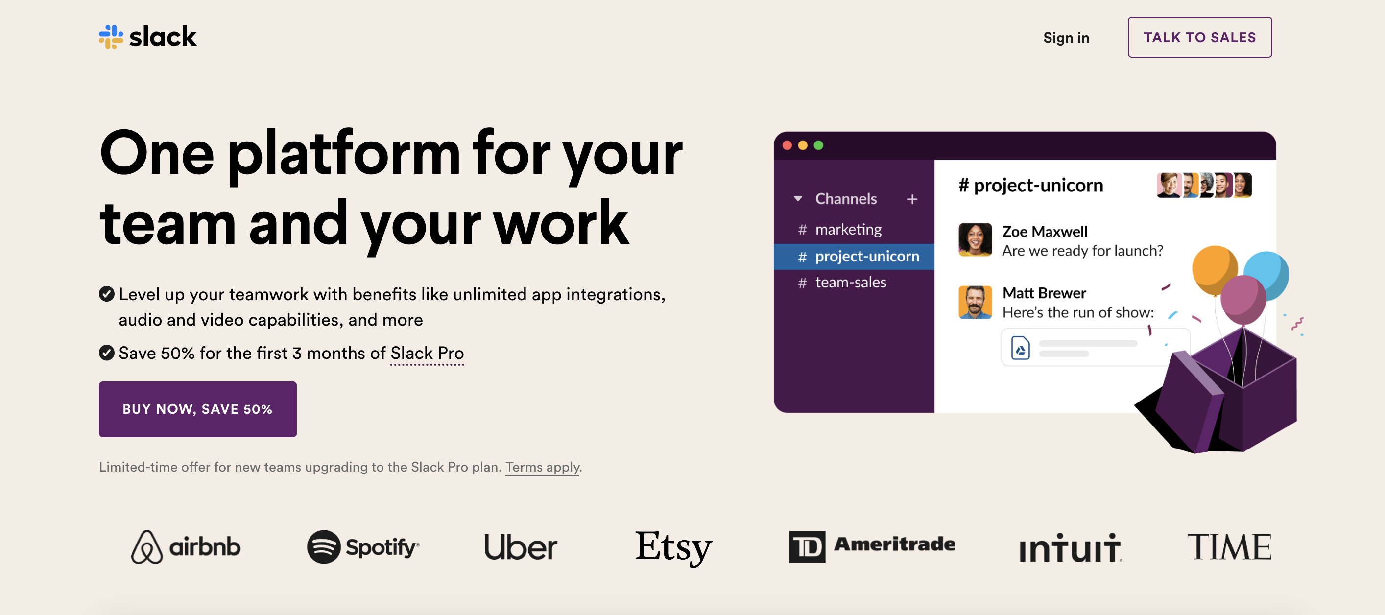
Slack is a popular team communication and collaboration platform. On their homepage, Slack showcases the recognisable brands and companies that use their product, such as Airbnb, Uber, and Spotify. By featuring these brands, Slack leverages social proof to build trust and credibility with potential customers, demonstrating that their platform is trusted and valued by industry leaders.
Optimise website speed
We all know the frustration of waiting for a slow-loading website, don’t we?
In fact, research suggests that up to 40% of visitors will leave a page if it takes more than three seconds to load.
Sluggish-loading pages tend to receive lower rankings on search engines like Google, making a fast load time essential for enhancing your SEO performance.
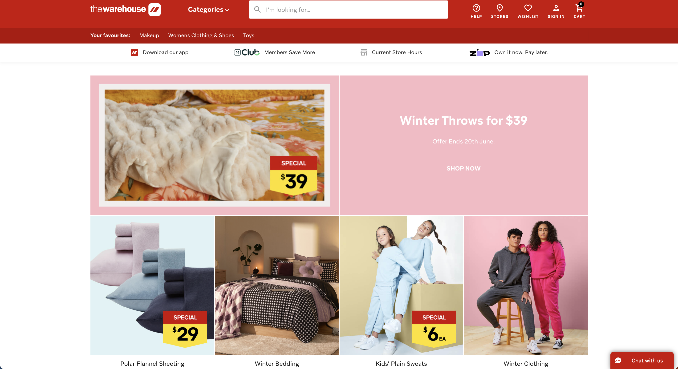
Promote exclusive offers and discounts
Consider leveraging your homepage as a platform to highlight any ongoing promotions, discount codes, limited-time sales, or special offers. Including this information prominently on your homepage can create a sense of urgency and incentivise visitors to take immediate action. Whether it’s a percentage off, a limited-time deal, or a special bundle, featuring these exclusive offers on your homepage can attract attention and drive conversions. Be sure to use eye-catching visuals and clear call-to-action buttons to encourage visitors to take advantage of the discounts or specials you are offering.
The Warehouse often features a dedicated section highlighting current promotions, discounts, and special offers. They utilise visually appealing banners, carousel sliders, and call-to-action buttons to showcase limited-time deals, clearance sales, or seasonal discounts on various categories of products. By incorporating such information on their homepage, The Warehouse effectively grabs the attention of visitors, promotes their ongoing promotions, and encourages potential customers to take advantage of the available discounts and specials.
Remember, the primary objective of your homepage is to assure visitors that you possess what they seek, both in terms of offerings and professionalism. It’s crucial to captivate their attention and entice them to explore further, all within a matter of seconds. If your homepage or website needs a bit of a refresh, we can help with that. Get in touch with our web team today to create a homepage that’s worth visiting.